Yearly review: Looking back at 2023
- Published on
- Reading time
- 11 min read
- Category
- Year in Review
In this post, I want to share some insights on how the year 2023 went for my websites. In July of last year, I started to collect some anonymous usage data on my website with an open source platform called Matomo. I wanted to get a better understanding of how people use my websites and what I could do to improve the use experience. So far, I’m very happy with the results and I have already made some changes to my websites based on this data.
I used Matomo instead of something like Google Analytics because I wanted to have full control over the data. I also think it is important to be transparent about the data and how I use it, so I decided to share some of the most interesting insights with you. So here are some numbers and other statistics about my two main websites from the last year.
My portfolio: pawcode.de
pawcode.de is my personal portfolio where I showcase my projects. I started working on this website sometime in 2018 and I have been working on it ever since. Last year, I decided to rewrite the whole website (again) and I am very happy with the result. The design is simple and clean and the technology stack is solid (at least for now). So let’s take a look at some numbers.
Visits, views and other general stats
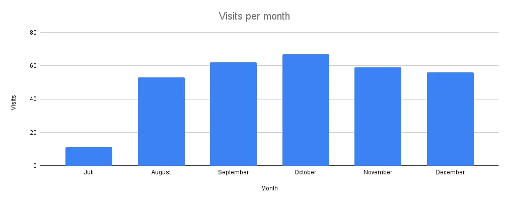
The website had 308 visitors in the last year with a total of 734 page views. The average number of visits per month is hovering around 50 - 60. I am happy with these numbers, but I would like to see them grow in the future. Here is a graph of these visits per month:
Another interesting thing to know is how many views each project has (talking about the project descriptions on my portfolio, not the websites themselves). Grouping the projects by category, the most viewed category is Websites with 65.6%, followed by Open Source with 26.4% and Legacy Android Apps with 8.0%. Even the most recent projects already have some views on them, which is nice to see. Here are the top 10 projects (by their views):
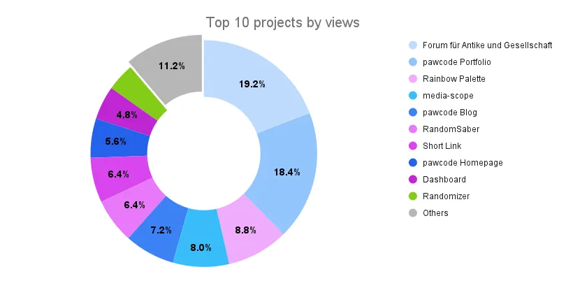
I kept the colors grouped by category similar to how they are on my website.
One last statistic before we move on to the users: the uptime of my website (and other services). In an ideal world, programs would never crash and servers would never go down with a 100% uptime. But unfortunately, we live in the real world and things break or need to be updated. To monitor the uptime of my services and get notified when something goes down, I use Uptime Kuma. It is a self-hosted open source monitoring tool that pings my services regularly and sends me a Discord notification when something goes down or by certificates are about to expire. I am very happy with this tool and I can only recommend it to everyone who wants to monitor their services. And so here is a graph of the uptime of my websites:
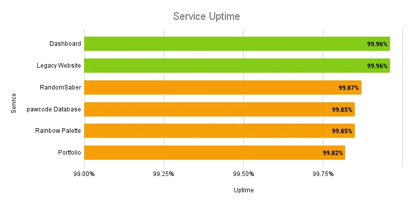
My goal is to have an uptime of at least 99.95% (which is 21.92 minutes of downtime per month). As you can see, I am almost there but there are two things to keep in mind: Unfortunately, the server running this monitoring tool had some issues on a day or two, not functioning reliably. I am still not sure what the problem was, but this caused the numbers to drop a bit, even though the websites were all up and running. Another flaw in my measurement is that I am only doing these health checks once per hour (or even once per day for some older projects). So if a service goes down for a minute, exactly when the health check is running, the downtime will be a lot higher than it actually was. This is why I don’t try to get “four nines” (99.99%) of uptime, because it’s basically impossible to achieve. I could increase the frequency of the health checks, but I don’t think it is worth the traffic and resources.
Users and their preferences
Now that we looked at what people do on my website, let’s take a shallow look at who these people are and what they prefer. I am not tracking any personal data, just some general information like the browser used or the preferred language of the user. In other words, just stuff that is already sent to the server with every request anyways. I also don’t use this data for marketing or advertising. Instead I use this data to get a better understanding of how people use my website and what I could do to improve their experience.
Knowing which device type and screen resolution my visitors use, I can optimize the layout of my website for the most common screens. In addition, I can also scale down the images in different sizes to save bandwidth and improve the loading time when the user is on a mobile device. To not go into too much detail, here is a graph of the different device types:
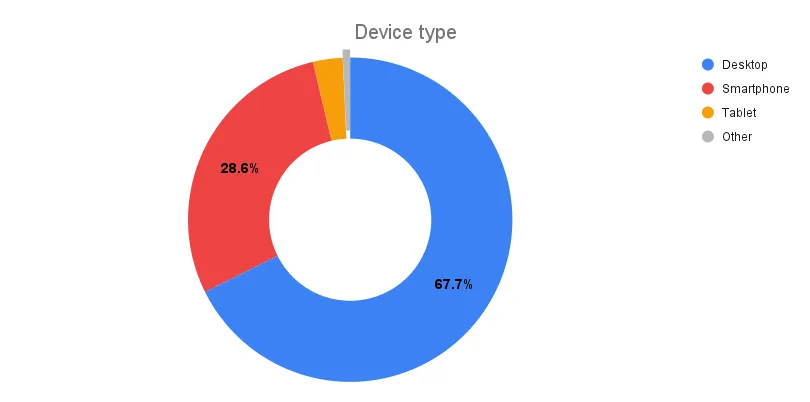
It is surprising to see that 32.3% of my visitors are on a mobile device, since I expected this number to be a little higher. The layout and design of the website was originally designed for desktop, but I tried to make it responsive so it also looks good on mobile. Maybe I should focus on more optimizations for mobile in the future.
Another thing I was worried about when designing the website was the theme. Drawing inspiration from HyperUI, I decided to go with only a light theme for now. I was thinking about also adding a dark theme, but I did not know how to make it look good. The only way to find out if this was a good decision is to look at the data:
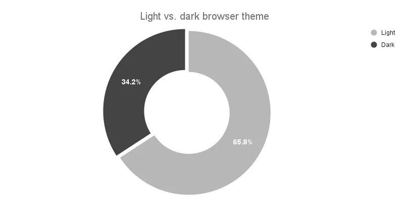
Even though the website only has a light theme, I can still track the user’s preferred theme (according to their browser settings). I was surprised to see that most people prefer the light theme over the dark theme. Personally I like dark themes more (at least on most websites), but I was never sure how to adjust the colors of my website to make it look good. Now I know that I don’t have to worry about that (at least for now).
The last thing I want to talk about (for my portfolio) is the preferred language of my visitors. I am a native German speaker, living in Germany with mostly German customers, so I decided to also write my portfolio in German. Let’s see how that worked out:
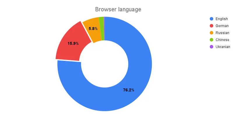
Well… I guess I was wrong. Looking at the data, only 15.9% of my visitors are from Germany (or speak German according to their browser settings). I am not sure why this number is so low, but I am thinking about translating my website to English to also make it accessible for all people reading this post. Unfortunately, I am not sure how to do that without making my current setup much more complex. This would also mean that I have to translate all my projects to English, which is a lot of work, especially for the older legacy projects. Maybe I will do that in the future, when I do another rewrite of the website.
My blog: blog.pawcode.de
As you might have noticed (if you are reading this post), I also have a blog. I thought about starting it for a long time and I am happy that I finally did it. I was not sure if I would be able to write interesting articles, but then two things happened: First, I discovered Astro and wanted to try it out. Second, I was giving a talk at a local developer meetup about HTMX and thought it would be too bad if I only presented it once. So this talk was the final push I needed to start writing my first post on this blog.
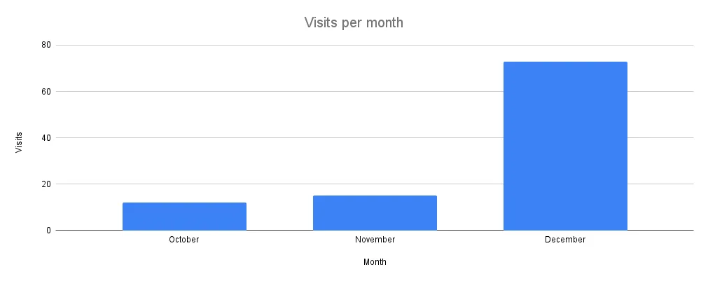
Visits and views
Since I only started this blog in late October, I effectively only had 2 months to collect the first data points. In these two months, I had exactly 100 visitors with a total of 121 page views. So far the average number of visits per month was just over 10 until a few days ago. Not sure what happened there, but I am happy with the overall numbers (even if December seems a bit unrealistic for now). Here is a graph of these visits per month:
Mimicking the format of my portfolio, I also tracked the views of each of my posts. But since I only have one post so far, I will just show you the top 1 post (which is also the only post).
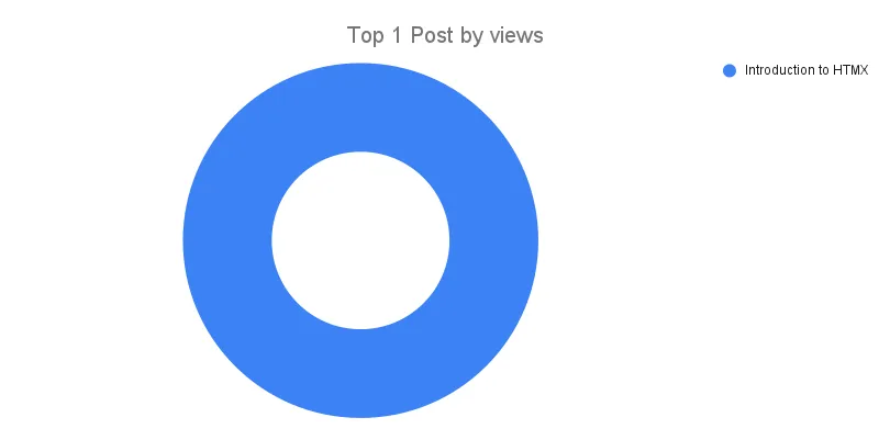
Obviously the chart is not very useful with only one post, but I wanted to show it anyways to keep the format consistent (both with my portfolio and hopefully with future yearly reviews). Talking numbers, the post has 38 views so far, which is not too bad for the first post on a new blog.
Of course I also tracked the uptime of my blog. Since I am using Vercel to host this blog (like my portfolio), I don’t expected any downtime there.
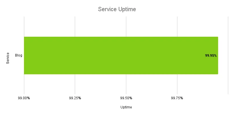
Actually there was one downtime of 1 hour in the last days of December, but I am not sure what caused it. Somehow the deployment was lost and I had to manually redeploy it. But since this was the first and only downtime in the last 2 months, I am not too worried about it.
Users and their preferences

Starting with device type (again), you can see that even less people are using a mobile device to read my blog. Only 2% of my visitors are on a mobile device, which is surprising to me. I really only read blogs on my phone on my daily commute, so I expected this number to be higher. But maybe that’s just me. As I said before, knowing the screen resolution of my visitors allows me to save images in different sizes to improve the loading time. This is especially important here, since I am using quite a few images in my posts. In addition, Astro makes it very easy to add responsive images, by just adding a few lines of code.
In contrast to my portfolio, I decided to add a dark theme to this blog (you can toggle it in the top right corner btw.). Since there is only text on this website, I thought it would be easier on the eyes to have the option to switch to a dark theme. And since I use Tailwind CSS for this blog, it was also very easy to add it. With no big and colorful components, I only had to change the background and text color besides adjusting the navigation bar. But unfortunately I cannot track the theme used by my visitors (at least for now).
The last thing I want to talk about is the preferred language of my readers here. When I started building this blog, I decided to write all posts in English rather then German like on my portfolio. Since the content is more technical and English is the language of developers, I thought it would be better to write in English to reach a wider audience.
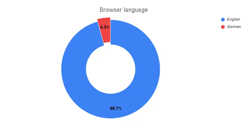
I think I was right, because only 4.3% of my visitors are from Germany (I suppose most of them can read English as well). So even though English is not my native language, I will continue to write in English.
What’s next?
I am happy with the results of the last year and I will continue to collect data on my websites in the future. My current plan is to write a yearly review like this one every year to share the most interesting insights with you.
I am also thinking about switching to Astro for my portfolio. This blog is already built with Astro and I am very happy with this decision. Writing posts in Markdown is so much easier than writing them in HTML and the performance is 🔥blazingly fast🔥 with only 0.63s load time. In comparison, my portfolio has a load time of 1.84s and I would love to get that down to 1s or less. But there are still some things that I need to figure out before I can make the switch.
I also want to write more posts on this blog. Two posts are already in the works and I have a few more ideas for future posts. I am not sure when I can finish them, but you can be excited for them.
Hope you enjoyed these insights and have a great year 2024!